THE #1 Thing to Remember When Making a Website
Problem
It happens all to often when I visit a website. I enter the site, and I’m confused what the purpose of the site is! Then, I ask myself, “What does this site want me to do?” Many times, I have no answer for that question, so I leave the website without purchasing, signing up, following, or doing what the site creator wanted me to do.
Now, I’m a web designer and developer with a number of years of experience in the field, so if I don’t have a clear idea of what you want me to do, then I’m sure everyday people without experience in web development are confused.


Solution
Before we discuss the solution, I can already see people shaking their heads and saying, “Tom, you obviously want to think about the purpose of your site. This blog is a waste of time!” I could see why you might think that, but TRUST ME; about 25% of the sites I personally visit have this major issue.
Step #1
So what is the solution? The first step is to identify EXACTLY what you want a user to do when visiting your website. This could be you want the user to sign-up, purchase something, learn something, hire you for a service, and more. Now, you might want them to do more than one thing, but let’s focus on the main thing you want them to do because this is the what you need to focus first.

Step #2
If you already have a site created, you want to evaluate the current site and pretend to be a first time user. If you don’t already have a site, create a design, and use the design to follow these same steps. Can you identify what the site is encouraging you to do? How do you know this?
However, I highly recommend doing something additional. Utilize Google Forms to create an extremely brief form. If you need help creating a Google Form, I’ll provide a good tutorial here: Google Form Tutorial. *Note* If you don’t have a site, use your preferred design tool (Adobe XD, Figma, Penpot, etc.) to create a design and then use the design to follow these steps. Next, literally create these three questions:
- What does “website name here” want you to do?
- What is “website name here” about?
- How long in minutes did it take you to understand what “website name here” wanted you to do?
Next, contact 3-5 people that you know, and politely ask them to view your site and complete the form. Encourage them to be brutally honest because you need tough criticism to really improve the site. An important thing to keep in mind is do not take negative feedback personally or let it discourage you. Use this feedback to improve and stay positive!
Let them navigate the site without any guidance because this will provide you with the organic feedback you need. Yes, you can do a more comprehensive user experience survey, but this will accomplish the same thing: FOR FREE.

Step #3
Next, it’s time to evaluate the survey results. You want to evaluate the results for similarities and differences. For example, if all of your participants had a different idea on the purpose of your site, it’s time to go back to the designing board. Don’t worry; I will provide examples on how to redesign in later steps.
However, if you identified the main purpose of your site to be getting users to purchase a product, but the participants thought the main purpose was to signup for an email list; it’s time to go back to the designing board. Don’t worry; I will provide examples in on how to redesign in later steps.
Now, if a majority of the user’s answers aligned with the main purpose you had in mind, then you are on the right track. At this point, you need to focus on how long it took each user to determine what the website wanted them to do.
Step #4
You need to keep in mind that people’s attention spans are shorter than they’ve ever been. This is due to the rise of social media and instant gratification being seconds away at all times. However, this topic is for another blog.
My goal on every site that I create is to have users be able to identify what I want them to do in under 30 seconds. This may sound impossible, but BELIEVE ME, it is possible and even essential. If users said it took them more than a minute, you need to reduce the amount of information on your site starting with your home page. If it took the users more than 3 minutes, you need to seriously reduce the information because your site is overcluttered. Let’s look at an example of what I’m talking about.
The website above is the home page of a local business in my area. This website a great example of what not to do for a number of reasons. Here is the full site: Example.
- The first thing you see when opening this site is a bunch of text. I can see that he has his contact information to the left and a number of options at the top. I’m assuming that he wants to be contacted, but the problem is the overuse of information. People don’t want to spend a lot of time reading information when they first enter your site, and it makes the main purpose of the site difficult to identify. You want the user to be able to scan your homepage in less than 30 seconds and be able to determine what you want them to do. You can describe your business in depth but do it on a separate page and in short chucks.
- If he wants people to contact him and his business, he needs to use his design to draw the users attention where he wants it. Nothing on this site is emphasized, so I’m having to spend extra time to determine what the site wants me to do.
Next, let’s look at an example on what you should do.
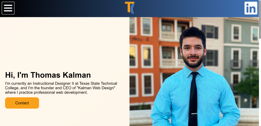
The website above is my personal site. Here is the full site: Example. Let’s get into why this is a good example. The main goal of my site is to get you to contact me.
- This site is easily scanned within seconds of opening. During the first ten seconds, I establish who I am and what I want you to do: contact me.
- Through my design, I use color and contrast to draw the user’s attention to the “Contact” button.
- I repeat the “Contact” button on my additional pages and later on in my homepage to further establish what I want the user to do.
You want to provide information in sections. For example, if you view my site and scroll down on the home page, I slowly establish my services and more information about myself. You want to use your home page as a short intro and provide exactly what you want the user to do. If you need to present more information, do it in chunks to prevent the user from becoming overwhelmed. The “chunk” method is used by a number of industries to prevent the user from feeling overwhelmed with content.
Please, don’t over exaggerate what I’m saying here. You an easily take this in the opposite direction. If you want somebody to contact you, you don’t need to shove “contact” buttons everywhere. Use it throughout your site, but don’t be annoying about it.
These same methods can be used whether you’re selling something, providing a service, or whatever it is you need to do. If you have questions, please leave a comment, so I can help!
Final
- Identify EXACTLY what you want a user to do when visiting your website.
- Create a user experience survey using Google Forms and utilize people you know to accomplish your goal without paying for people to participate in the survey.
- Evaluate the survey results and determine what you need to change.
- Aim to get the main purpose across to users under 30 seconds, and use your design to draw people’s attention where you want it.
About the Author

I’m a professional web developer, instructional, UX/ UI, and multimedia designer. I’m the founder and CEO of “Kalman Web Design” where I practice professional web development and more. If you need my services, please reach out here: https://thomaskalman.com/contact.html.
If you have questions, I will answer!